Skip to content

A New Vision Takes Flight

Share:

by Ben Osborne

It can be argued that the city of Vancouver stands alone in North America for its mix of true big-city feel and authentic outdoor experiences. Fittingly, it also now stands alone in sports team branding with the breath-taking logo and name for its new PWHL team: the Goldeneyes.

The first PWHL team to be named after an animal, the Goldeneyes logo will take centerstage at Pacific Coliseum when the season begins this month, and given the passionate fans in the market, you can expect to see it all over British Columbia’s largest city as soon as folks can get their hands on new merch.

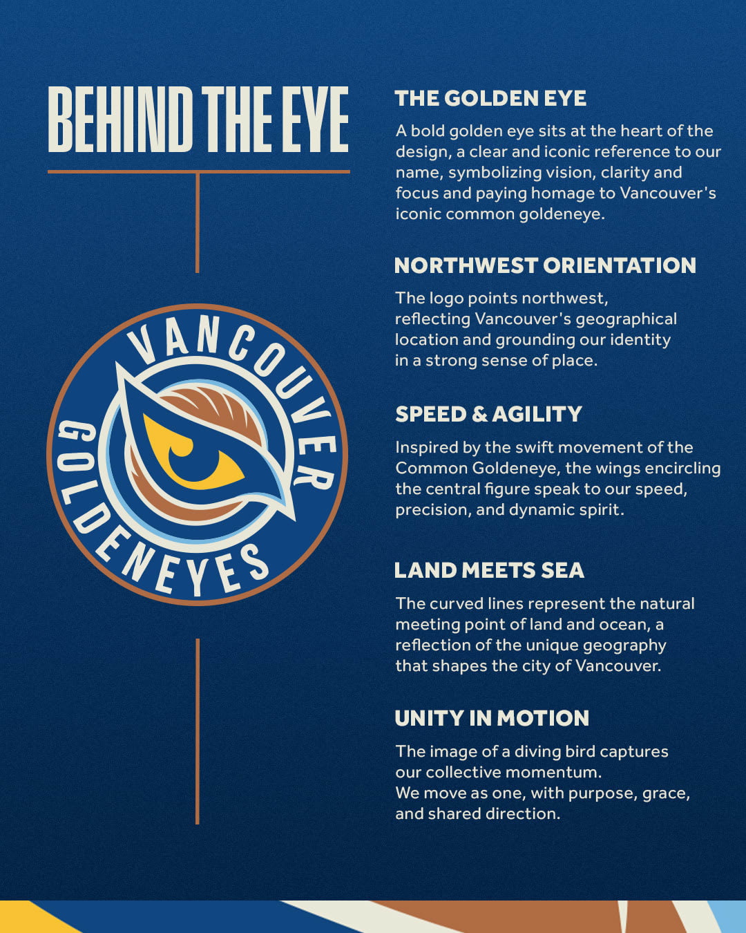
“The name was born from a desire to create a team identity that felt truly unique to Vancouver; something that could only belong to this city and its natural surroundings,” explained Ali Bologna, the PWHL’s Senior Director, Brand & Marketing. “As the creative process unfolded, we explored local wildlife, looking for a symbol that was both visually compelling and rich in meaning. The name Goldeneyes draws inspiration from the Common Goldeneye, a striking bird native to British Columbia’s coastal waters and forested lakes. Known for its piercing yellow eyes and lightning-fast reflexes, the goldeneye is a creature of precision, agility, and resilience—qualities that mirror the game of hockey and the athletes who play it.”

Vancouver forward Jenn Gardiner, who signed with the Goldeneyes after a standout rookie season with the Montréal Victoire, grew up just outside Vancouver in Surrey, BC and is overjoyed about everything related to this team’s existence. Very much including this team name, logo and overall branding.

“I'm so excited to have grown up in the lower mainland and now I get to represent the Vancouver Goldeneyes,” Gardiner said. “‘Goldeneyes’ has an aura around it that can intimidate others. We have an incredible roster and the best staff in the league, and I can’t think of a better group to go into this first season with. It will be really exciting to grow with the name. I really never imagined something like this happening where I grew up. It’s beyond my wildest dreams and I cannot wait for our first game!”

As Gardiner alludes to, the Goldeneyes are not the type of expansion team we’ve seen in other sports where fielding a competitive roster is a challenge. Vancouver is loaded with skill all over the ice and boasts an experienced winner behind the bench in coach Brian Idalski.

If hometown hero Gardiner and her talented team performs as well as many expect, it will match the quality of their color scheme. Gardiner praised the team’s “vintage look” and said, without hesitation, “we have the best color scheme in the league.”

Vancouver’s Director of Business Operations, Tania Richards, is another local native who is feeling the look of her team. “The color palette feels very Vancouver. It’s the everyday view that Vancouverites have—waters to our left and mountains to our right. Or the other way around,” Richards explained with a chuckle. “That’s the blue, the brown, the gold. That’s who we are. It also feels very nostalgic, a retro feel you can see in the jerseys we just released."

Richards also appreciates the nostalgic vibes because of the team’s home—the aforementioned Pacific Coliseum. “A historic building on historic grounds,” as Richards puts it. It’s also the first arena in the league where the PWHL team is the primary tenant. This means things like a PWHL team’s logo on the ice are a reality, which will be unveiled shortly and is going to look spectacular.

One more local influence on the Goldeneyes’ look came from the designer who crafted the Goldeneyes logo—yet another local product.

“Having a designer from Vancouver design the Goldeneyes logo brought an authentic, local perspective that helped ground the brand in the region’s identity from the very beginning,” Bologna explained. “Her familiarity with the city’s natural landscape and cultural nuances allowed us to explore ideas that felt truly right and native to Vancouver. You can see that intentionality in every detail of the logo. Every stroke has purpose, and every element carries meaning that ties back to the region.”

For a team debut already decorated with numerous “firsts,” the Goldeneyes can proudly claim another: the first PWHL team named after an animal. This is no small thing, as the players themselves proudly point out.

“I’m obsessed with it being an animal,” Goldeneyes goalie Emerance Maschmeyer said. “I’ve been waiting for an animal with this league for a while now. So, I’m really excited about that. The eye is really intense for me and I love how sharp it is. But also, the feathers above the eye, I’m going to do something really cool with that with my pads.”

One of the highly touted defenders who will be tasked with making Maschmeyer’s job easier, two-time PWHL champion Sophie Jaques, echoes this:

Besides the team's name, colors and logo, Vancouver organization insiders also had thoughts on the brand manifesto, which reads:

On the Pacific’s edge, where the sea mounts to mist where tree lines vanish in the sky... distance sharpens the view and vision becomes instinct. We move with the wind. With purpose and unwavering focus. Swift in flight, boundless in view. A clear force of clarity and vantage. Sharp-eyed. Fast-winged. Bearers of vision. All-seeing and all-knowing. Moving as one. Drawn to the edge. Wired to defend. A force formed in flight. WE ARE THE VANCOUVER GOLDENEYES."

To Vancouver General Manager Cara Gardner Morey, who hails from Ontario and is coming off a 14-year career with Princeton Women’s Hockey in New Jersey, the Vancouver-inspired name Goldeneyes presents some exciting opportunities for her to define the team’s style of play.

“Goldeneyes travel in groups together. They defend. Their fight instinct,” Gardner Morey explained. “They move with the wind. I really love thinking of the speed of the game. We’re going to be a fast, tenacious team. And they always look from above and I want us to see the game that way.”

Gardner Morey, who was an All-American field hockey and ice hockey player while a student-athlete at Brown University, has also coached at numerous levels for Hockey Canada and served as a development coach for the NHL’s Philadelphia Flyers. All this to say, she knows what makes high-level athletes and coaches tick. To that end, Gardner Morey had an astute and poignant take on the importance of her 2025-26 Goldeneyes organization to the entire meaning of the team’s history.

“As players and staff, it’s really about the people. We tend to think of a team in terms of the players and coaches who came before us. That’s what makes a team name mean something. Well in this case, we're the ones that are going to make what this image is. We’re going to define what Goldeneyes means to people. That’s a responsibility for us, and I look forward to that,” she said. “My goal is to be Vancouver’s favorite sports team. I want the people to feel like it’s their team. Not just a sports team—a part of their community they care about. We're going to be a very entertaining, high-octane team and I want that logo to be something they have an emotional connection to.”

Those words from Gardner Morey are music to the ears of Bologna, who saw this entire project through. “Ultimately, I hope the Goldeneyes will mean home,” Bologna summarized. “That it will be the team that feels like it belongs to the city, not just geographically, but emotionally. That fans will wear the logo with pride, not just because they support the team, but because it reflects who they are and where they’re from.”